
Alcatel
Alcatel is a telecommunications manufacturer based in France. In 2014 Alcatel tasked ReignDesign with providing a new direction for colors, typography, iconography, wallpapers, and UI design for their premium phone. Alcatel’s target user is young, irreverent, and value driven. Adopting the principles of Google’s Material Design, I along with ReignDesign creative director, Andreas Sundgren, introduced a modern and energetic approach that evolved the Alcatel experience.
Year
2014
Discipline
Interaction Design
Responsibilities
UI, Icon Design, & Motion Design
Existing Product
Alcatel’s existing UI attempted to unify all the elements by using a limited color palette which resulted in a consistent, but visually redundant presentation.
Figure 1: The icon set demonstrated a youthful approach. However, this approach lacked refinement as some icons utilized shadows and others were flat.
The existing UI lacked personality and a distinguishable character that users could identify as an Alcatel product.
Color and Iconography
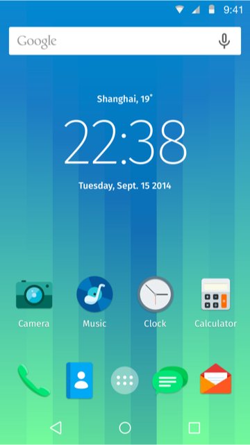
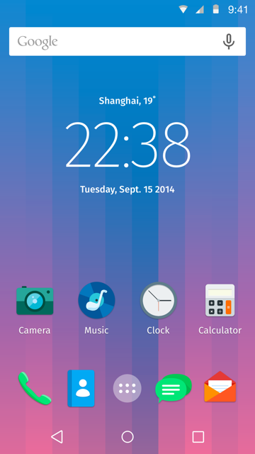
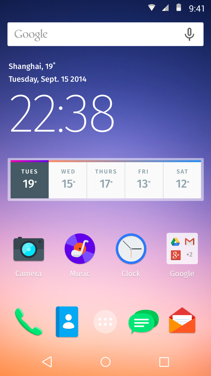
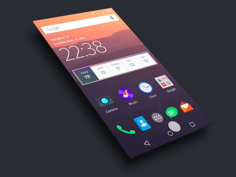
In the fall of 2014, Alcatel ran a #WEAREBOLD social campaign. Taking cues from the campaign, a full-color spectrum was introduced to capture the movement.
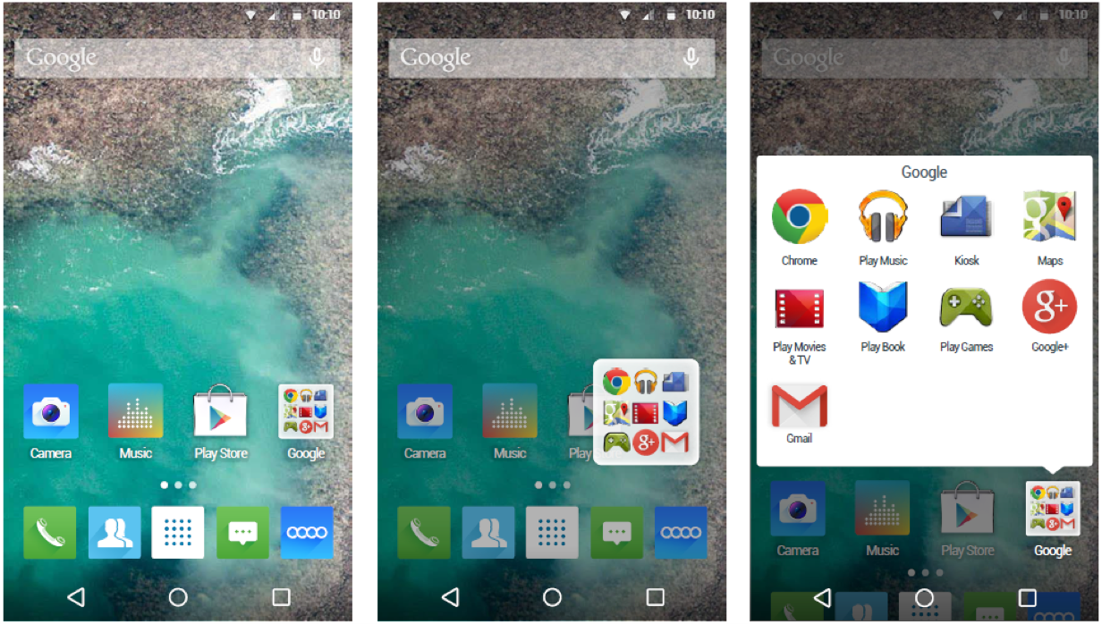
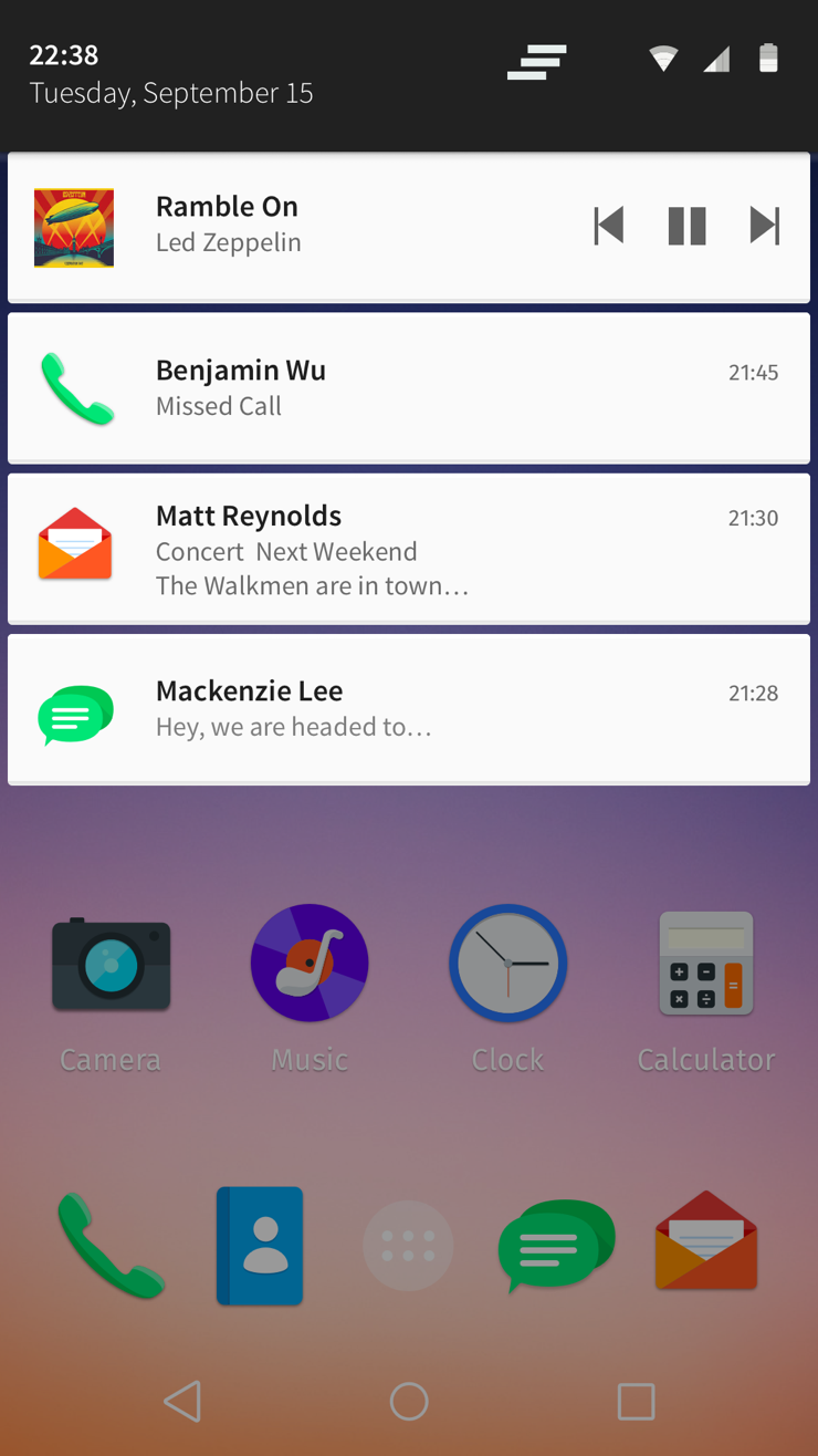
No longer restricted to a bounding box, the icon set proposed shapes that stood by themselves in distinct and bold forms. We created this first set of 6 icons as the initial direction for the UI design. Large radiuses and updated color palette helped create a distinct approach.
Figure 2: The animation illustrates the construction of the mail icon. We incorporated proportional radiuses at all corners. Instead of using drop shadows and gradients we choose a tonal color palette to give dimensionality to a flat icon.
Wallpapers
A colorful set of wallpapers was introduced that could work as stills or animated. The wallpapers were created to closely match the color of the icons either tonally or in a complementary fashion.

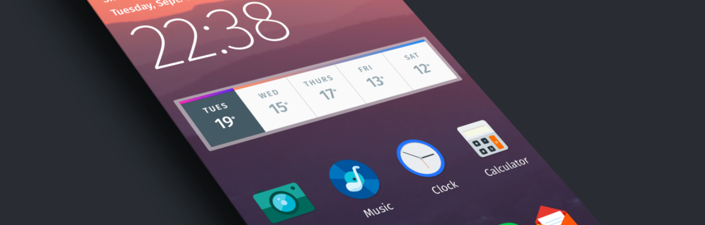
Typography and UI
Fira Sans developed by Erik Spiekermann in 2014 for Firefox was proposed as an alternative to Roboto, Android’s standard font. Fira Sans is designed for legibility at small sizes and is intended for digital use. Fira Sans also possesses a uniquely warm character and a particular charm.
Typography also informed the UI. With a large set of weights (16), Fira Sans allowed for a diversity of type layouts resulting in a distinctive and engaging user experience for the Alcatel user.
Fira Sans

The launch of the clock app uses real-world physics to create a life-like sensation of movement.
© Jason Wong. All Rights Reserved.