

BMW Financial Services
BMW Financial Services China (中国) required a website and app for prospective car buyers to utilize before purchasing a car. Previously, the process was a mixture of digital tools and analog forms that made the process incredibly complicated for dealers in China to track and collect all the information necessary to purchase a car. I led a small team tasked with aggregating all the components of the process in order for both applicants and dealers to track the progress of applying and to use the website and app as a means to communicate. The project included both a web and mobile application process that sought to provide timely and meaningful information to all the stakeholders.
Year
2016
Discipline
Interaction Design
Responsibilities
Information Architecture, User Mapping, UX, Usability Testing, Prototyping, and UI
Information Architecture
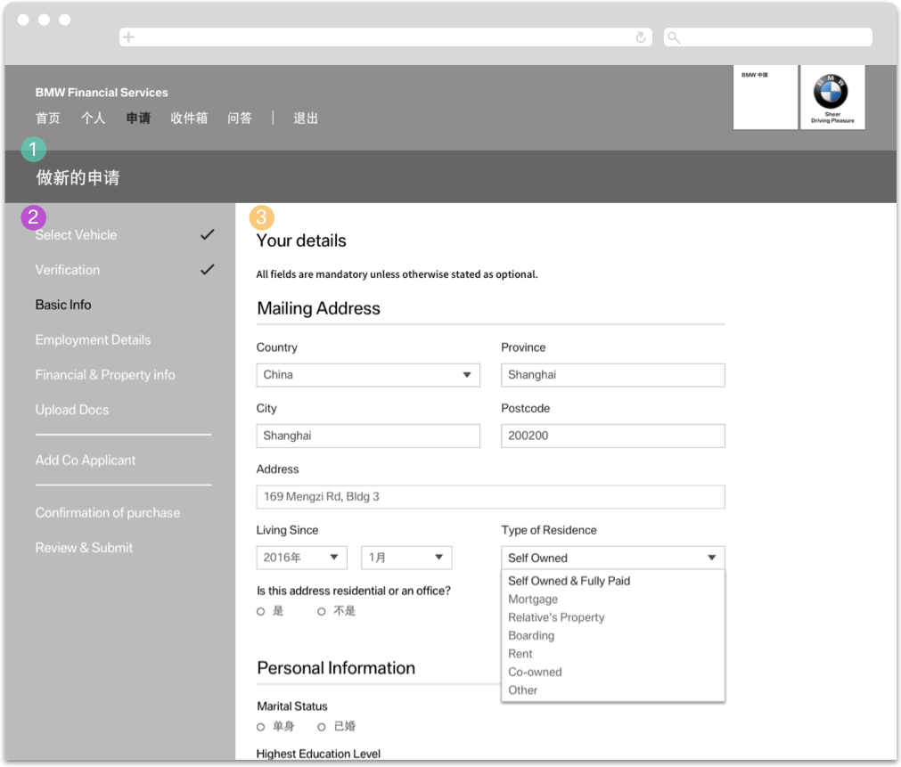
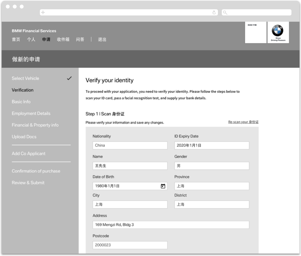
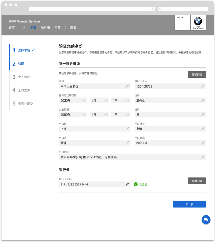
A huge task that included identity, address, and income verification; the process of buying a car included more steps than in America. We incorporated facial and ID scanning to reflect the necessary steps to comply with BMW’s requirement. Because of the complexity and the amount of personal information required we reduced the information visible to the applicant at each point to not overburden them throughout the process.
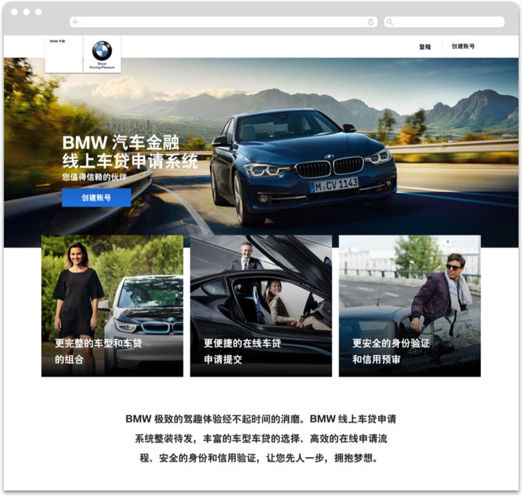
Website Introduction
The website included an introduction page that engaged first-time customers in the car buying process. Users would create an account to start an application to purchase a new car.
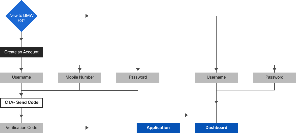
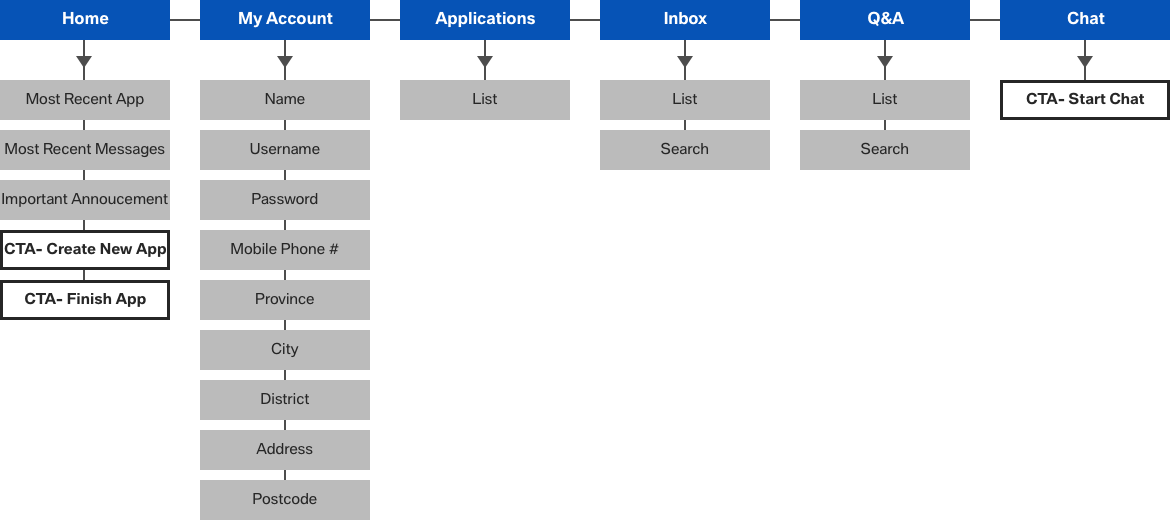
Dashboard
With sign-up complete users would be directed towards a dashboard that included applications, inbox, q&a, chat, and account information. The dashboard provided all the information and the necessary tools to track and communicate with BMW Financial Services.
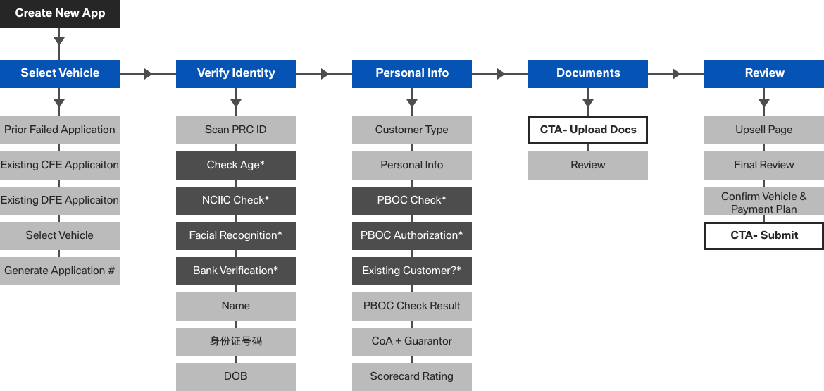
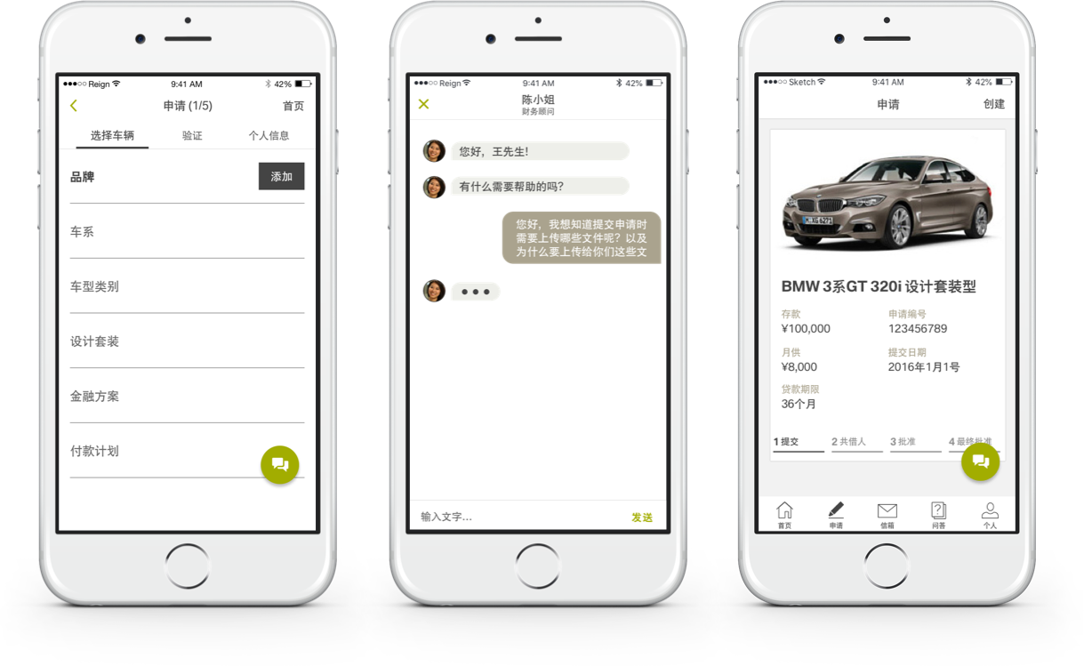
Application Process
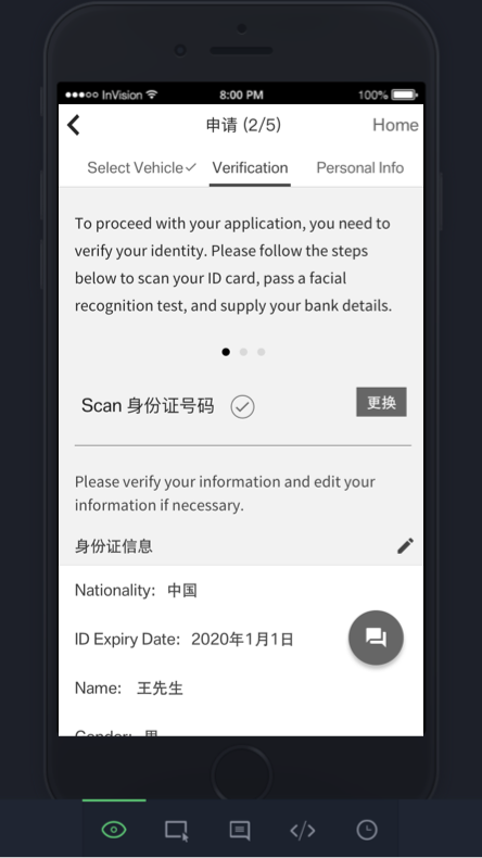
The application process included scanning of identification and facial recognition to comply with standards set forth by the government. Due to the standards, the entire process was lengthy including many steps. We tried to give applicants only relevant information for each task in order to not tax their cognitive bandwidth. We gave them the option to move forward or backward in the process so they would be able to recall or preview what steps were remaining to complete the process.
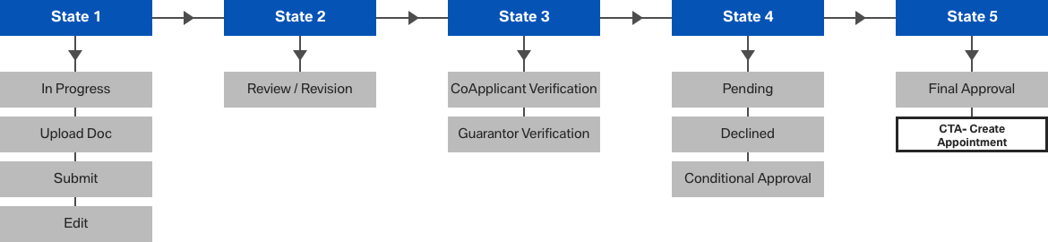
Application Status States
The process of submission and approval needed to be communicated to the applicant in a way that wouldn’t overwhelm them, but provide the necessary information.
UX
Website Wireframes
This navigational style works top to bottom and left to right for simplicity and clarity. Wireframes were created to be tested in an InVision click-through prototype. Due to time and budget constraints, I tested the prototypes with the team and our office assistant, Deliah, who had no prior knowledge of the project.
Design Rationale
For the secondary menu during the application process, we wanted to allow users to preview what items to complete, show completed progress (checkmark) and selected states (black text) to keep users focused on the task at hand.
We opted to use labels above the fields for better legibility. Users wouldn’t have to scan left and right to remember the field label. Instead, the labels are grouped in the same visual space as the input field.
1. Primary Navigation
2. Secondary Navigation
3. Fields
Wireframe Testing
After testing, we simplified some of the steps to reduce complexity. For example, we grouped employment details and financial property into the basic info section.
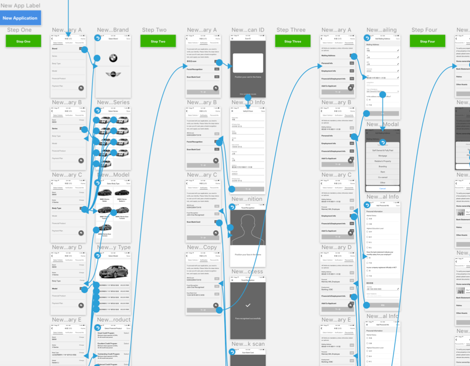
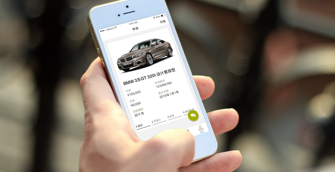
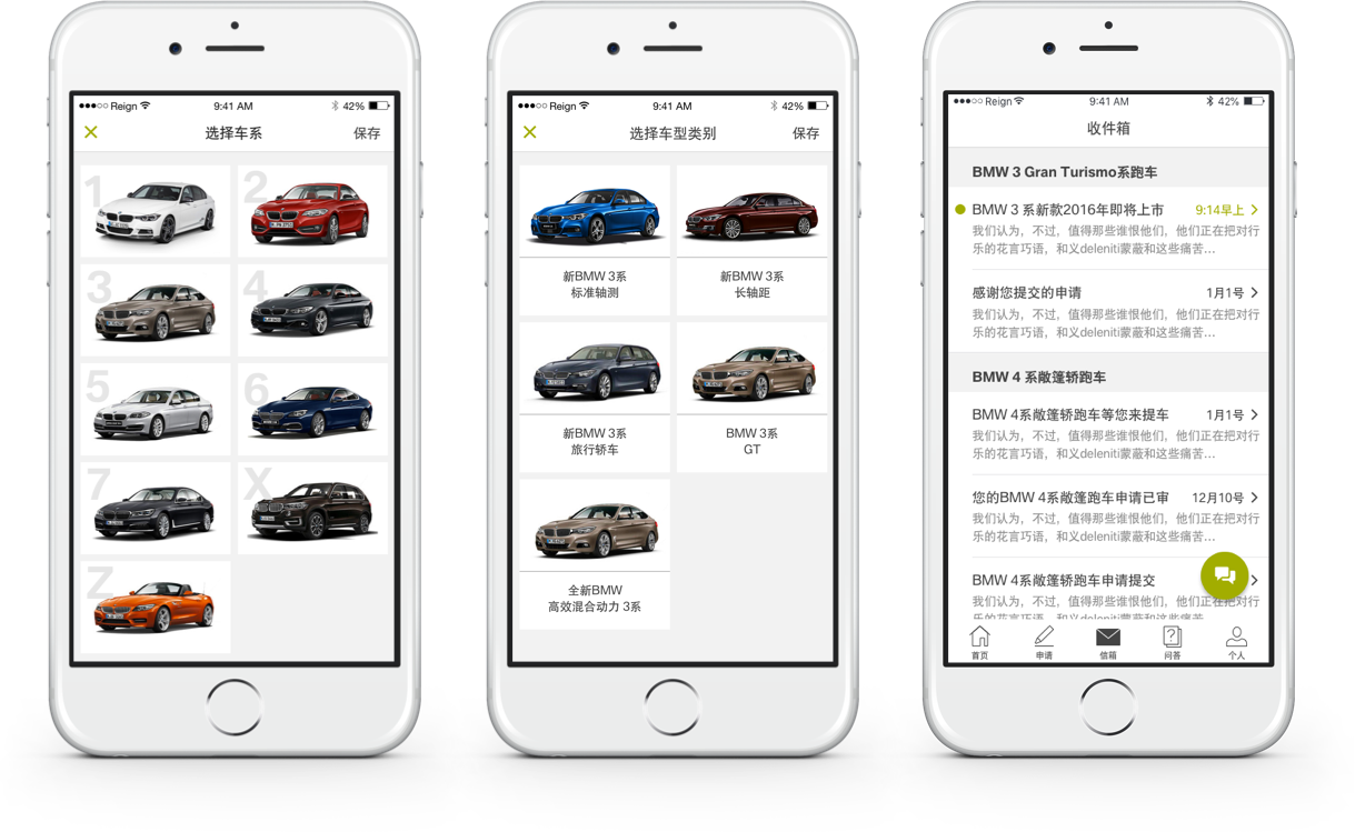
App Wireframes
As the mobile screen is much smaller than a website we were challenged to maintain the same experience but not to overburden the user. We introduced modal states (e.g. writing in an email) to help users focus on one task at a time when selecting the features of their car, the modal states allowed for the main page in the select vehicle section to act as a record for users. To prototype this interaction an InVision prototype was also created.
Design Rationale
Small cues such as the numerical steps helped inform users where they are in the process. Additionally, the checkmarks are used in the same way as the website notifying users of the completion of a subtask.
Testing
We learned the users were distracted in the select vehicle flow and decided to use more modal states (e.g. writing an email), seen in the chat, so as to not distract and allow the user to be focused throughout.
UI
The UI direction for BMW financial services had to comply with the BMW design standards. Button styles, colors, and imagery were strictly enforced. Because of the standards, we focused on clarity and usability to provide an engaging experience that wouldn’t task the user throughout the car buying process.
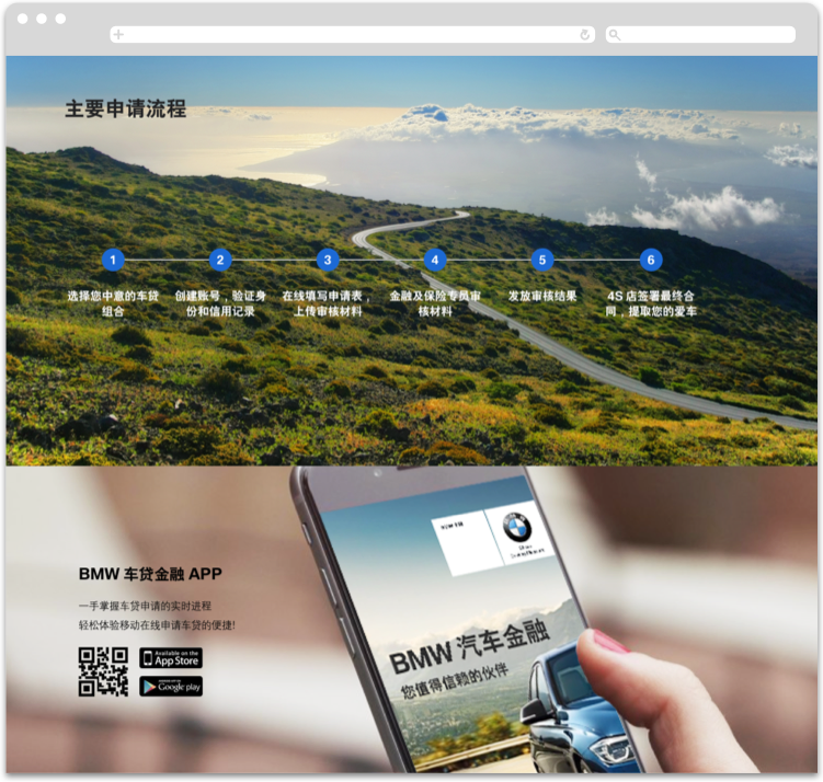
BMW Introduction Page
The introduction page’s goal was to provide discrete amounts of information that guided the first time user into the application process. We elected to display the app at the bottom of the page as we wanted to focus on introducing the whole process from application, approval, test drive, payment, and pickup.
Application
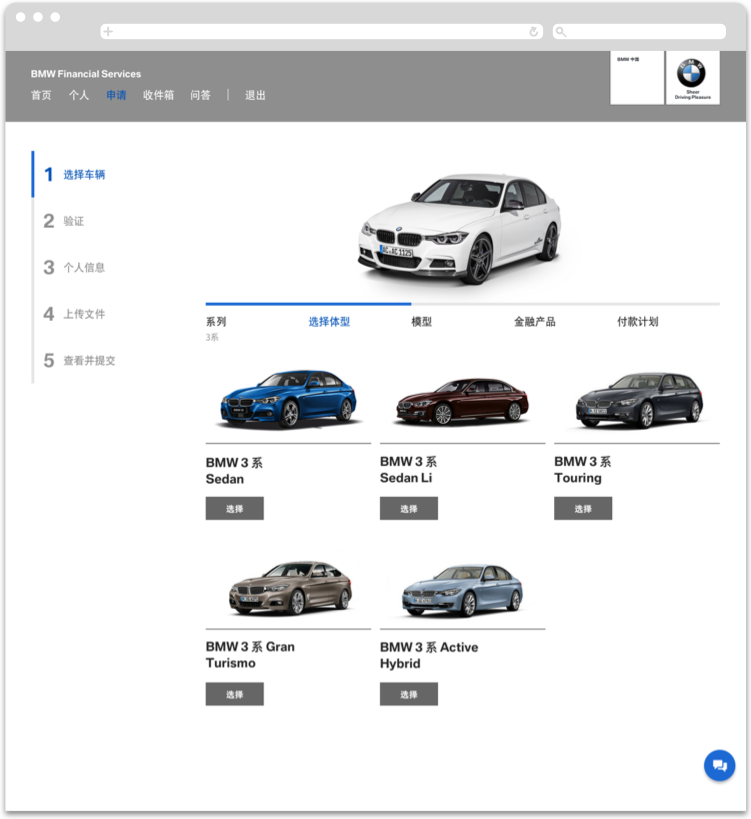
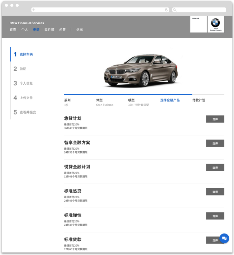
As to not overwhelm applicants we broke up the steps into smaller subsets. For example, the selection of the car is the first step in the overall process of applying. We created a secondary horizontal navigation to allow applicants to understand the whole process of selecting a car (make, model, color, financial package, etc.). Applicants would then proceed to verification, basic information, uploading documents, and review.
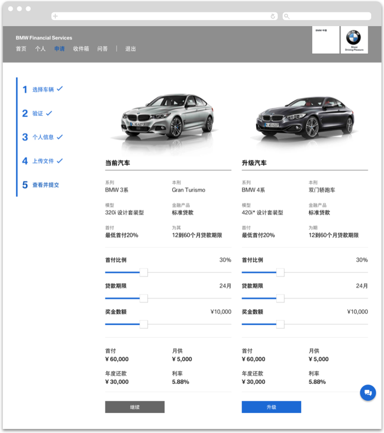
Verification & Upsell
The verification of the ID / 身份证, face, and the bank card were necessary to the application process in order to avoid fraud. The upsell page was crucial for BMW to show how other cars could also be purchased by the applicant.
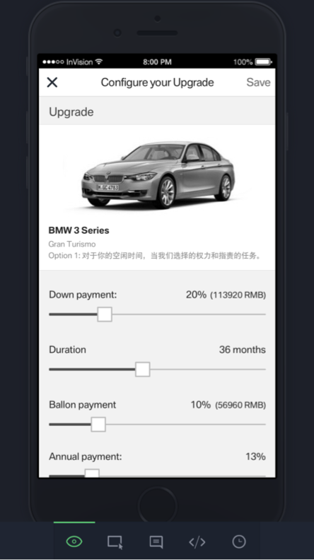
App
The app included the same elements present on the website with slight changes to match the mobile experience such as a ubiquitous chat button, accessible to applicants at all times. The app was particularly important as Chinese users are more comfortable with sharing financial and personal information (e.g. WeChat) with companies. Because of the smaller screen sizes, we utilized modal states (e.g. writing an email) to keep applicants focused on each task. The app’s UI was changed to match the parent brand (BMW groups) as it also included Mini. Therefore, we altered the colors to match the styling but kept it consistent with the website.
We added more focused states for the select vehicle flow and updated the labeling after a selection had been made.
© Jason Shun Wong. All Rights Reserved.