Tasklinks
Intended for small business owners, Tasklinks unifies an email client, task management, and contacts in a single app.
There were several stages of the project. First, I was tasked with unifying the UI elements to create more contrast, clarity, and legibility for users. The second stage for the client and our teams was to implement a new feature, timeline task management. Over several iterations, I worked closely with a developer to break down certain elements in order to create an incremental and seamless process from design to implementation.
Year
2014—2015
Discipline
Interaction Design & Mobile
Responsibilities
UX, Usability Testing, Prototyping, UI, and Motion Design
Design Review
Existing UI
The existing UI was a great foundation to work with. However, the low color contrast did not clearly define the experience for the user. I worked to introduce a stronger palette and unify the UI elements (icons, shapes, and spacing).
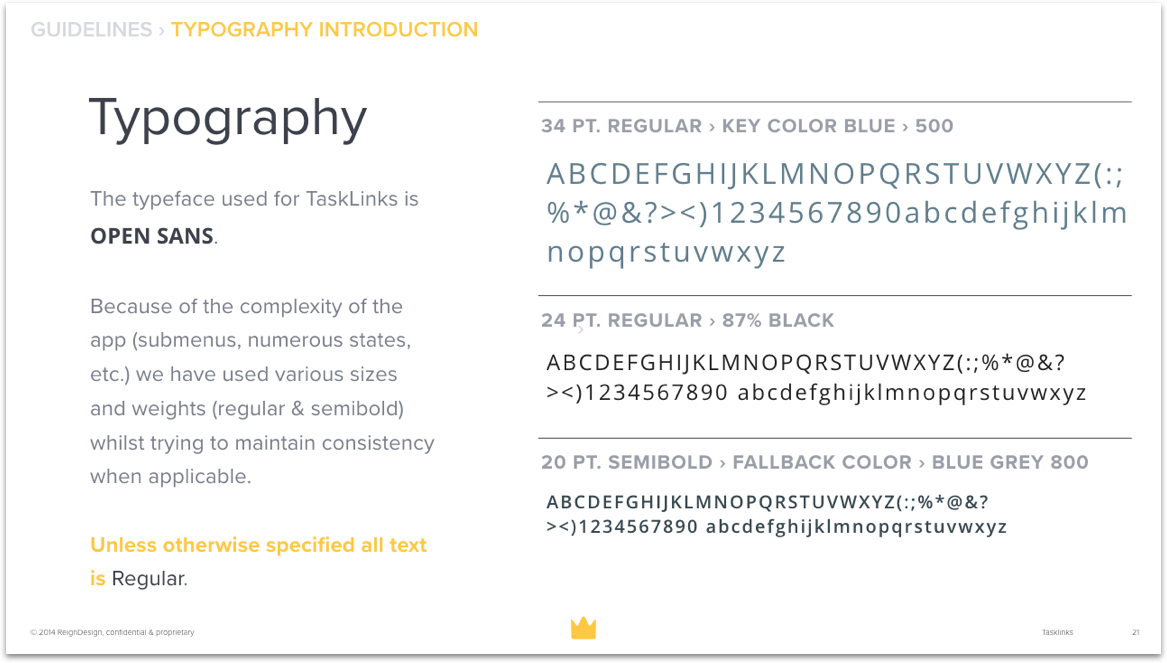
Figure 1: In addition to working on the color and typography, I wanted to create a document viewable externally (client) and internally (developers, managers, and designers) that would serve as the guideline for the proposed changes.
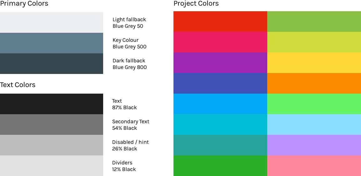
Color
I along with design director, Andreas Sundgren, developed a new color scheme introducing cool grey as the primary color as the previous grey was too warm for the mobile experience. Additionally, we took inspiration from Google’s material design for the application of text alpha values to ensure legibility.
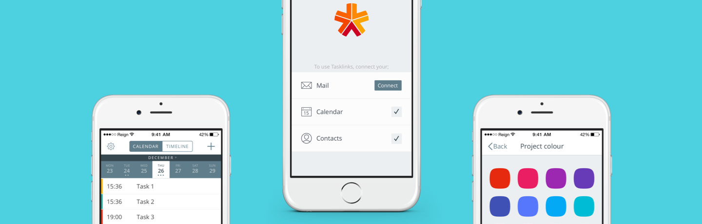
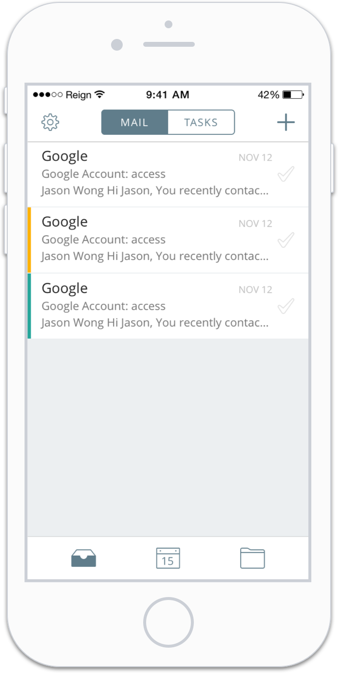
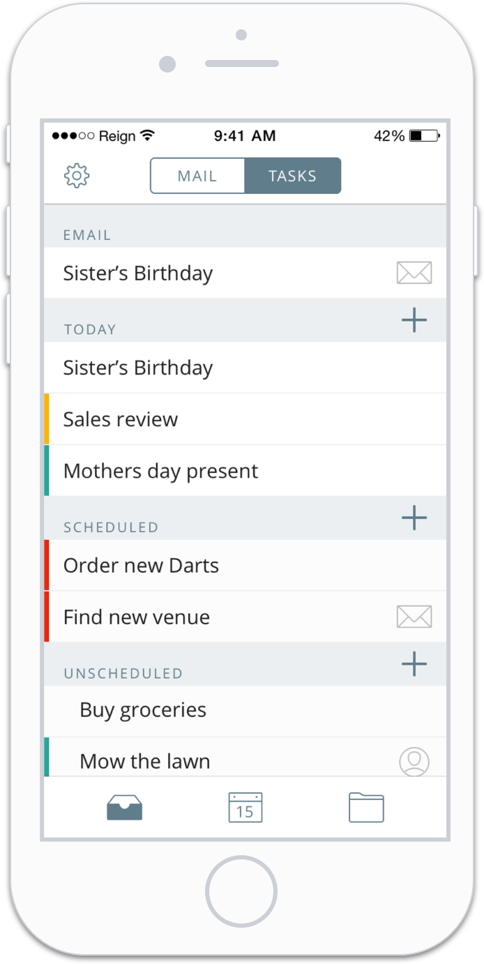
Color: Mail & Tasks
The blue-grey was used to highlight active states. For example, the mail tab and the mail icon are saturated to clearly denote the active state. The removal of warm grey provides more contrast to create better legibility. Here users read mail and create tasks.
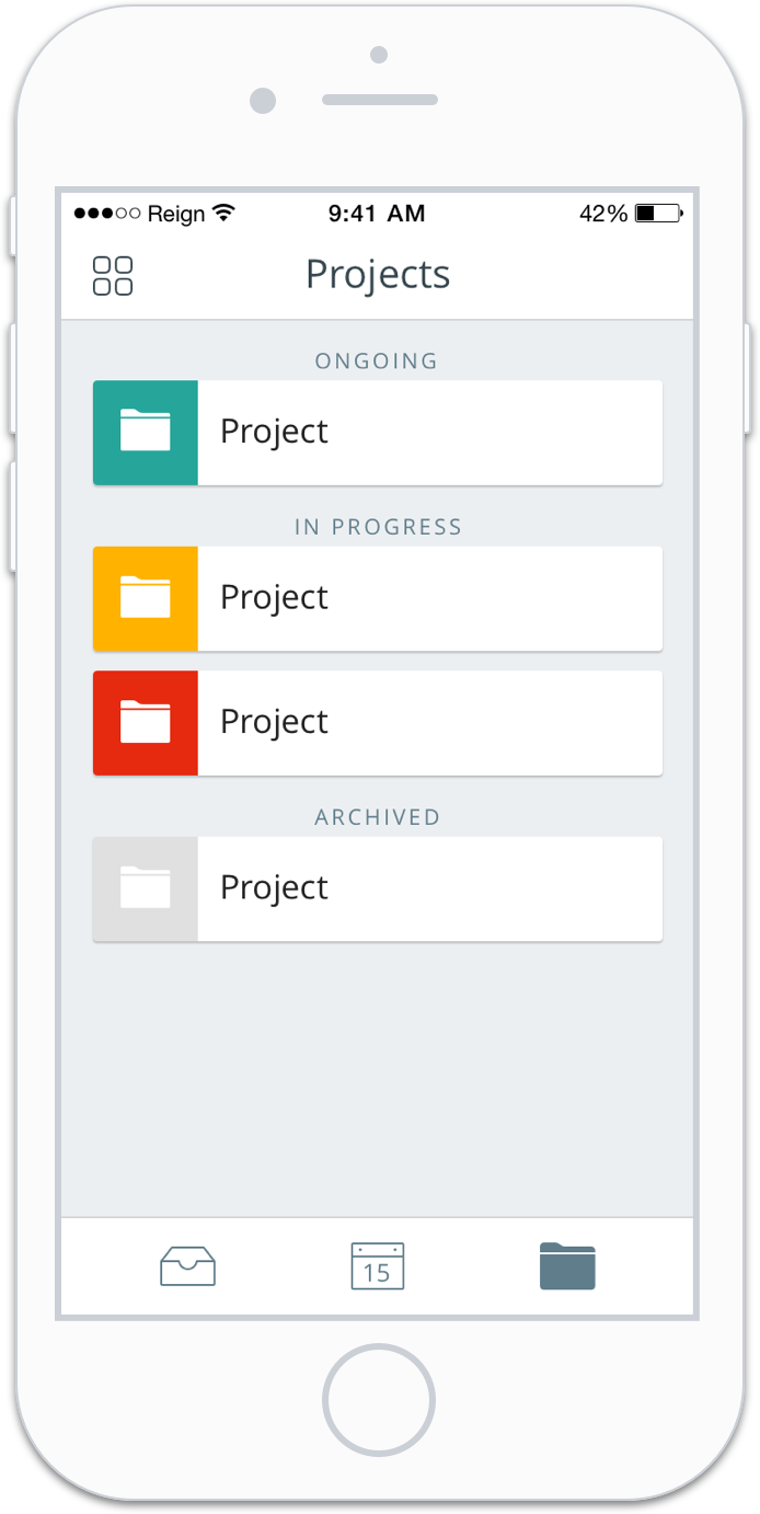
Color: Project
Color in the project overview section was applied with boldness for clarity and energy. Additionally, we created cards for each of the projects for added visual weight. In this section tapping on a specific project reveals the events and tasks associated with the project. Projects have a start and end time, associated emails, tasks, contacts, and files.
Color: Typography
Once the changes were approved by the client, we developed a strict set of guidelines that outlined, typography, layout, and application. This document was not only for the client but also for our team. Developers would be able to reference this document when implementing changes. We opted to continue using Open Sans, specifying color, size, and character spacing.
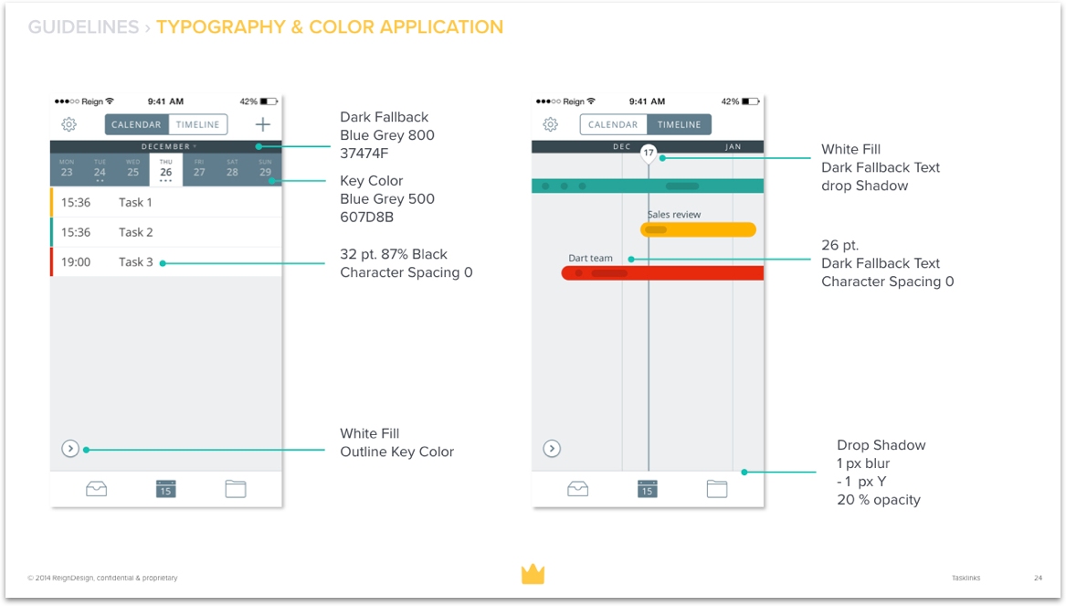
UI Guidelines: Putting It All Together
The typography and color application guidelines showed the developers how to put it all together, including color, type size, and character spacing for all the elements.
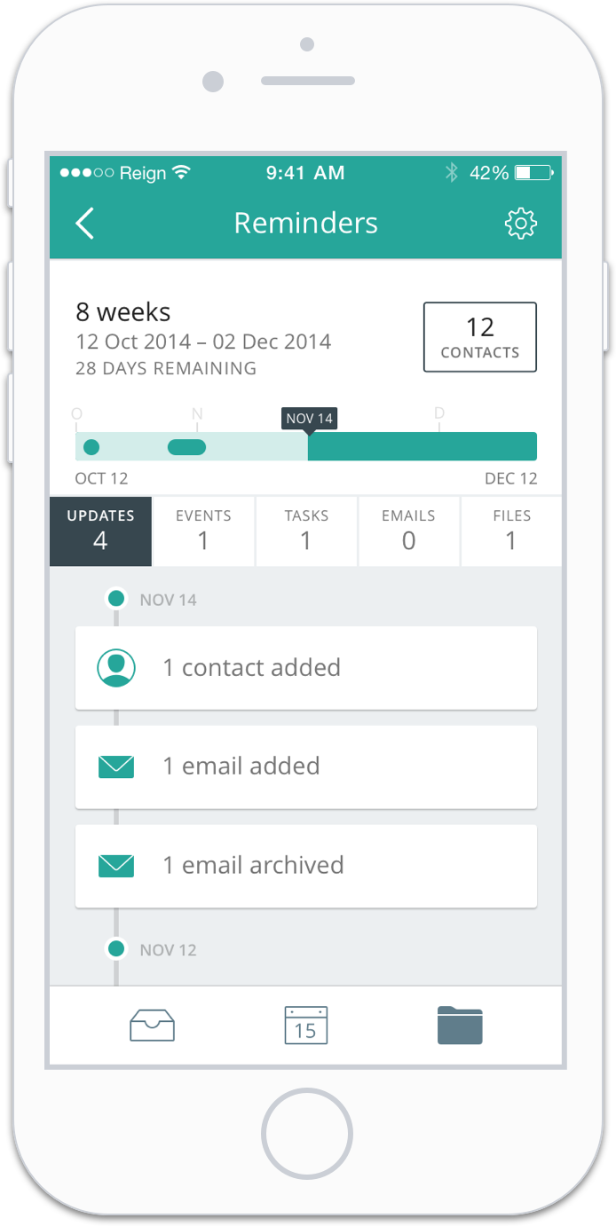
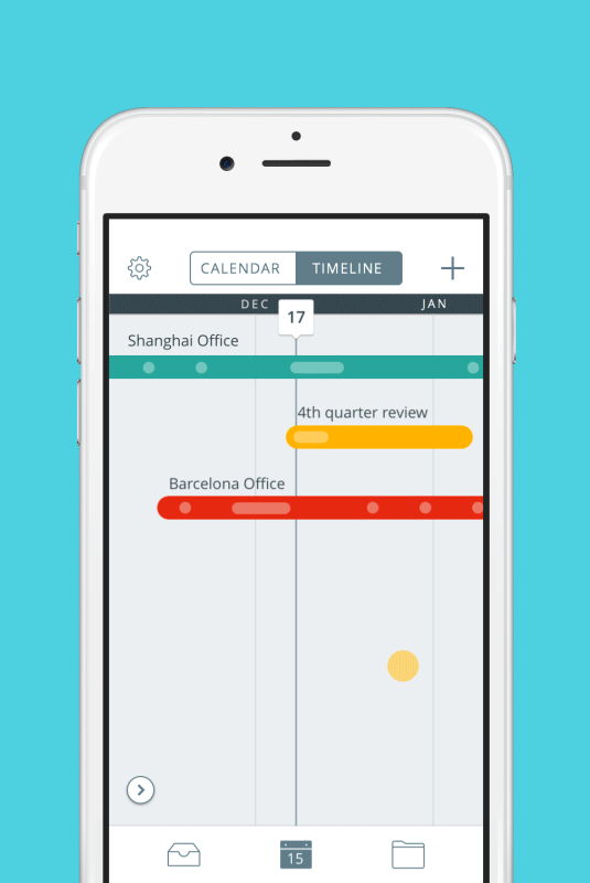
Timeline
A quick way to visualize the length of a project is toggle to the timeline view of the app. Here, users can see several projects at a glance and expand one of the projects to look at a detailed view of what tasks and events are happening on a certain day. I worked on several iterations of the timeline to refine the functionality and usability.
Iteration 1
Tasks and events are grouped together in a single column.
Iteration 2
Events and tasks are separated.
Iteration 3
Events have a start and end time whereas tasks only have a start time.
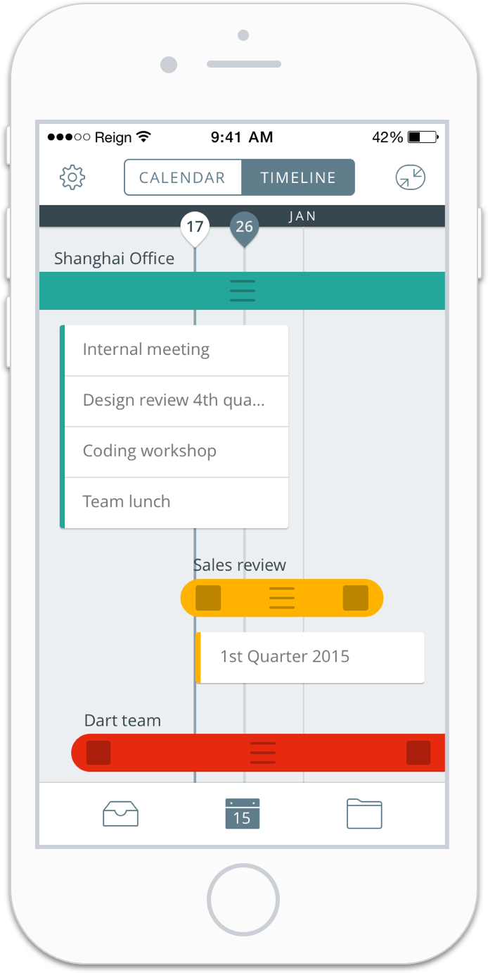
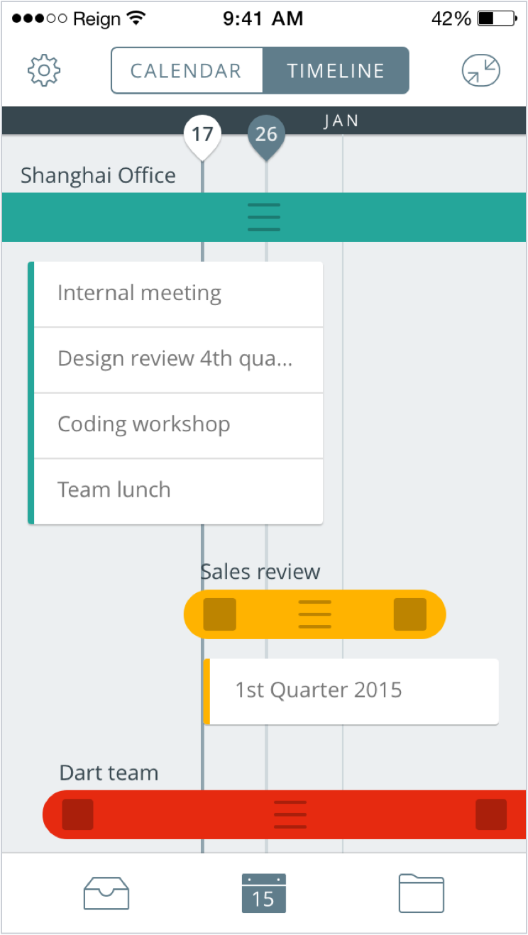
Iteration 1
The first iteration opted for a list view that of the events that happened on that certain day. Users had to tap to expand on the events, indicated by the three lines, for an office (Shanghai office) or project (Sales review). The two squares indicated tap to extend the length of the project.
Refinement
Our QA lead, April Liu, and users had some difficulty understanding the tap to expand function. Also, users had difficulty with the tap to extend project length function. This needed to be simplified to reduce ambiguity. Additionally, April pointed out that the list form didn’t indicate differences between tasks and events.
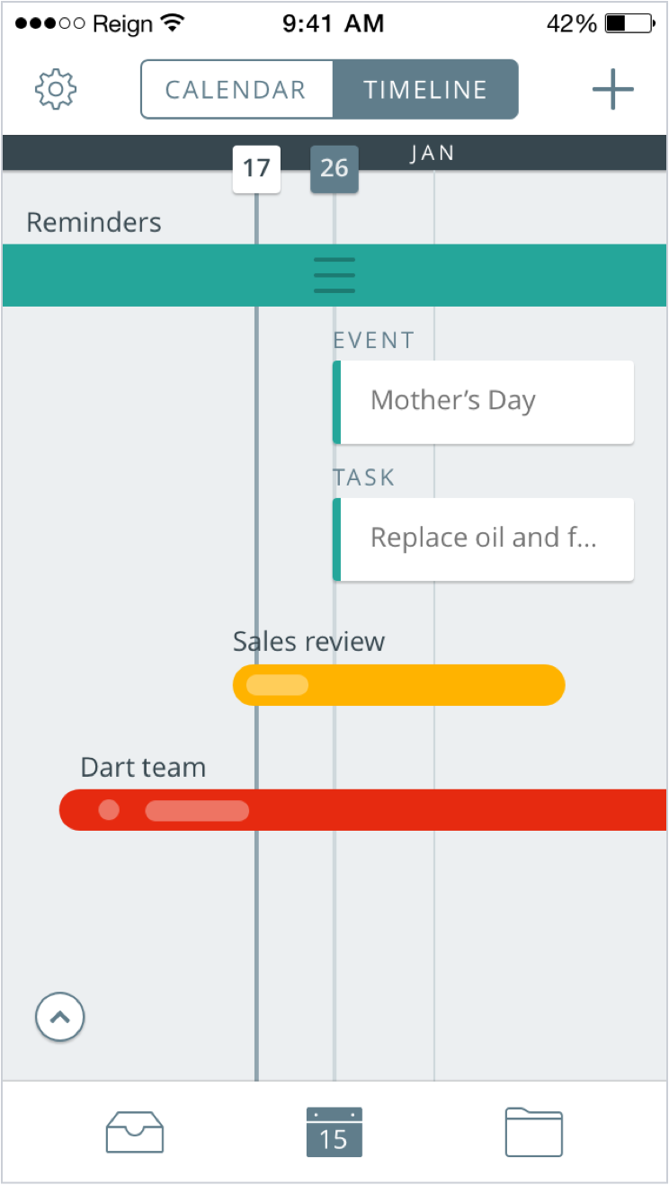
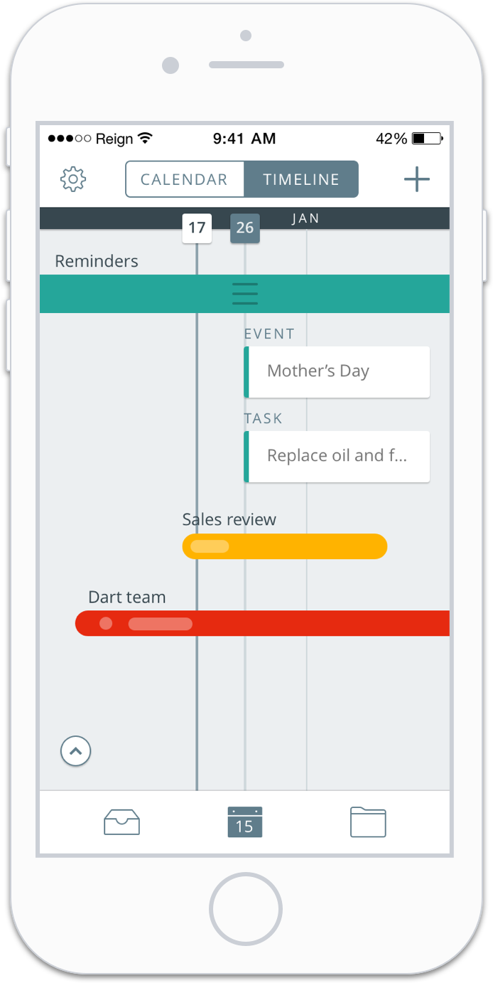
Iteration 2
The second iteration opted to label events and tasks. I kept the three lines only when the project was expanded. The labeling of task and event clarified the difference between the two. I opted to indicate events and tasks by using dots and ovals that overlaid on the projects to visualize the associated tasks when projects were viewed in the condensed format.
Refinement
The labeling and visual indication helped. However, the vertical height of the spacing was too large for the events and tasks taking up too much space.
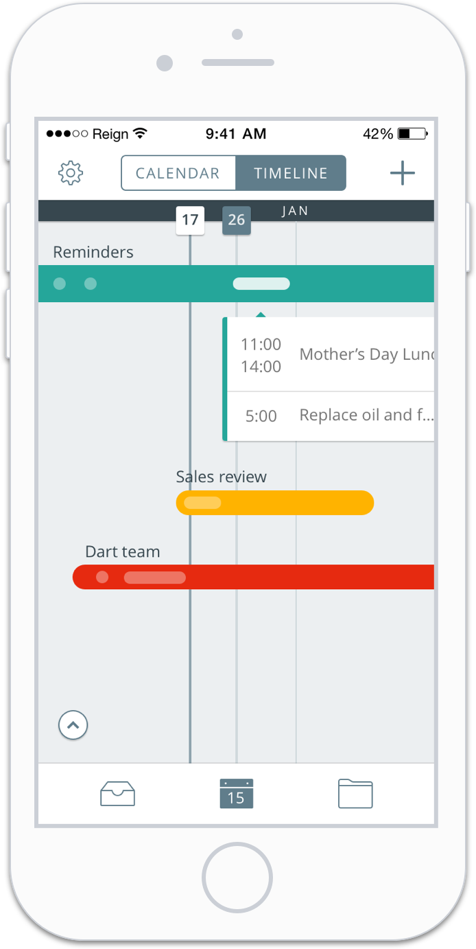
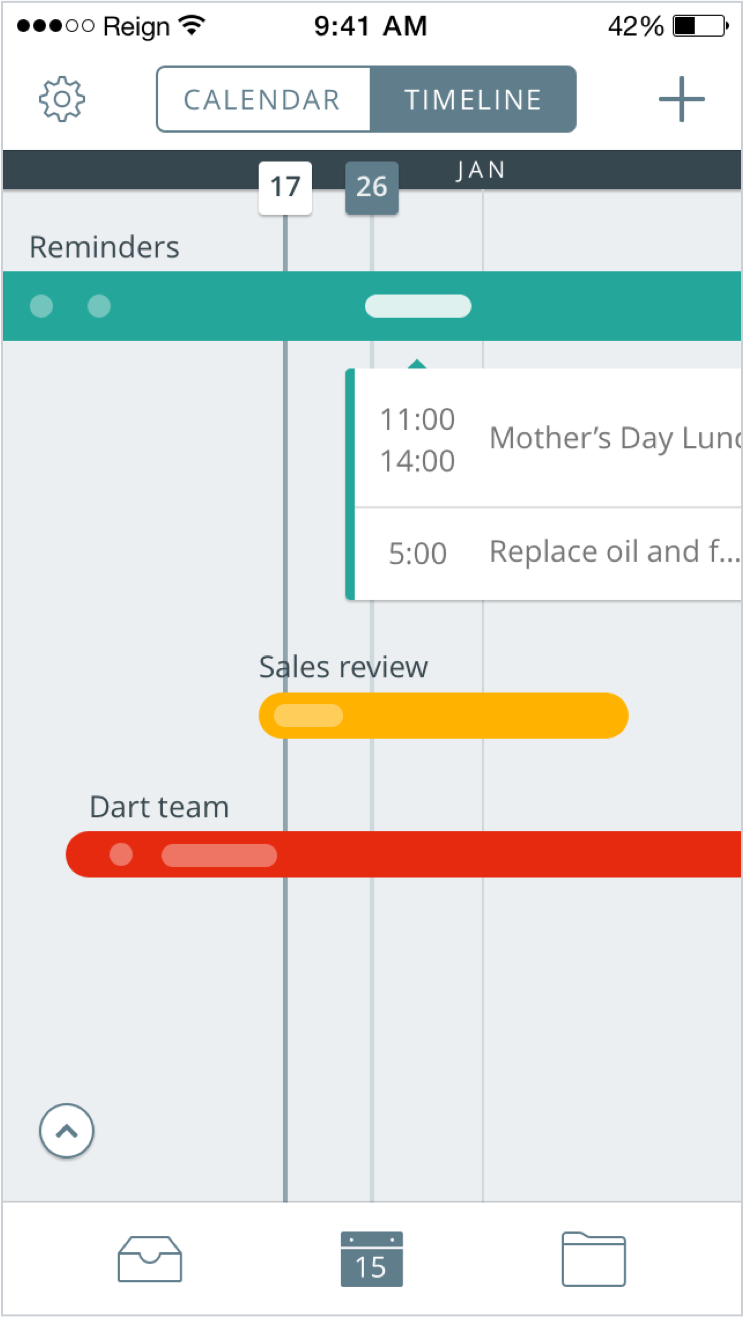
Iteration 3
The third iteration opted to visually show the differences between events and tasks without the need for a label. When tapped the opacity of the events/tasks becomes bright to indicate an active state. Events have a start and end time whereas tasks only have a start time.
Refinement
The next step was to develop an animation prototype to inform the developer of the transitions necessary to create this new feature. I also added a reschedule button to each project in the final iteration.
This gif displays how a user would utilize the timeline section of the app to see the events and tasks of the day. Eventually marking one of the tasks as complete.
To note is the stacked events that happen on consecutive days and the reschedule button.
© Jason Shun Wong. All Rights Reserved.