
Citroën
Citroën China needed a modern way to present user manuals for DS, their premium sub‐brand, to be used at the Shanghai Auto Show. Augmented Reality was utilized with a smartphone to provide new car owners with an intuitive way to learn about their car.
The challenge of the project was to translate a physical user manual into a digital tool that didn't encumber users and allowed them to intuitively locate and learn about their car. The timeline of the project was incredibly short as we had a month to design, develop, and test for the Shanghai Auto Show.
Year
2015
Discipline
Interaction Design
Responsibilities
Information Architecture, UX, UI design, and Usability Testing
Information Architecture & UX
The information architecture required several layers of detail. The initial mapping sent by Citroën included a vast amount of items difficult for a regular user to access, especially in the language they used to describe an organize the app. I sought to simplify, organize, and make it easier for a user to understand how the app would be structured.
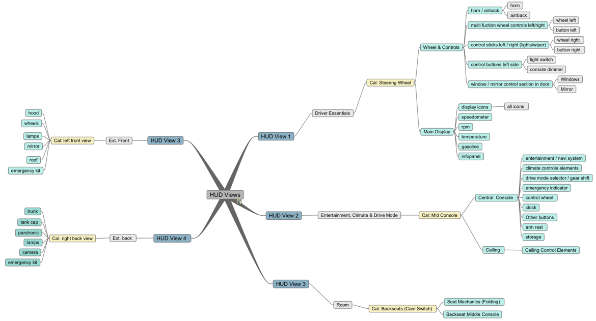
Figure 1: Citroën initially proposed the organization for the app seen above. However, this wasn't organized spatially instead it was organized similarly to a paper manual. Labeling a section driver essentials for augmented reality didn't make sense.
Information Architecture
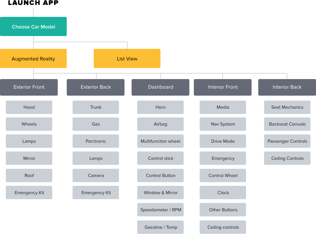
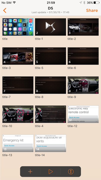
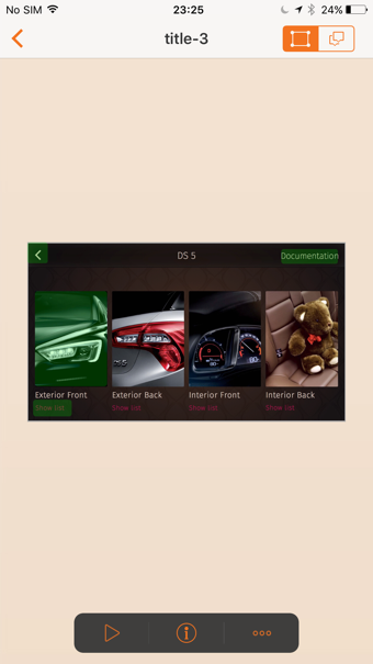
To simplify we organized the app into five sections easily understood to be different areas of the car. Users would have the option to use the augmented reality portion of the app or they could look at it in a list view. This provided a more seamless way to navigate to items that needed detailed explanations.
UX Flow and Wireframes
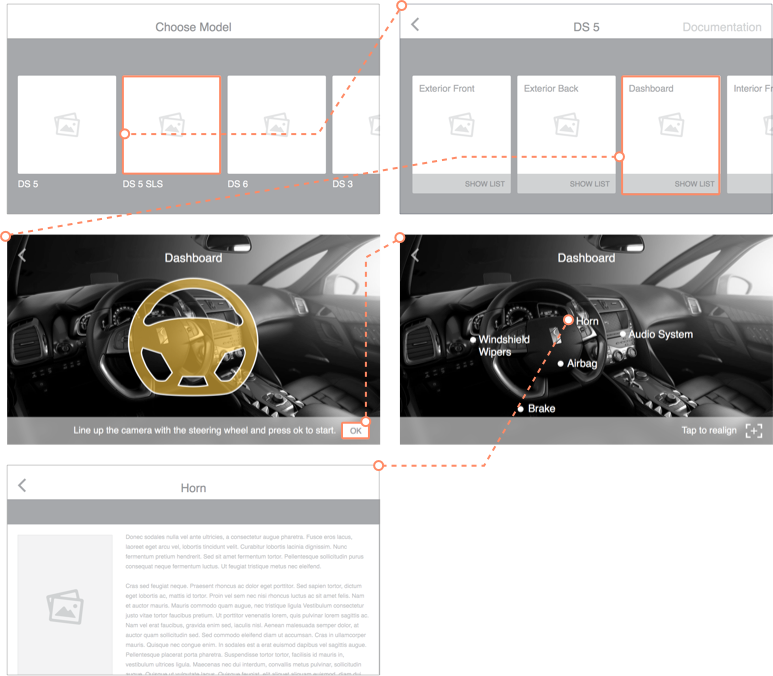
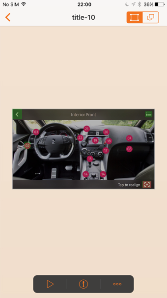
First, car owners chose their car model. Next, the car owners select which area of the car (exterior front, exterior back, dashboard, etc.) they want to explore. At which point users align their phone, press ok, and select a specific item, horn, to look at in detail. Notably, the app was designed in a landscape format, the client and our team agreed this would be the easiest way to interact with the app to learn about your car.
Prototyping
During the design process an interactive prototype was created. The prototype helped the client and developers understand the app before development took place. It was particularly useful for the client as they were able to interact with prototype and make quick judgements based on a nearly complete demo.
UI
As the DS brand aims to attract the new generation of wealth in China, ornate patterns along with a maroon, brown, and silver color palette are utilized throughout the app to align with the DS brand guidelines. The UI was also created in both English and Chinese which required different typographic approaches that aligned with the affordances of each language. For English, I used Fira Sans and Heiti for Chinese. The Chinese app required more generous character spacing to allow the characters to have room.
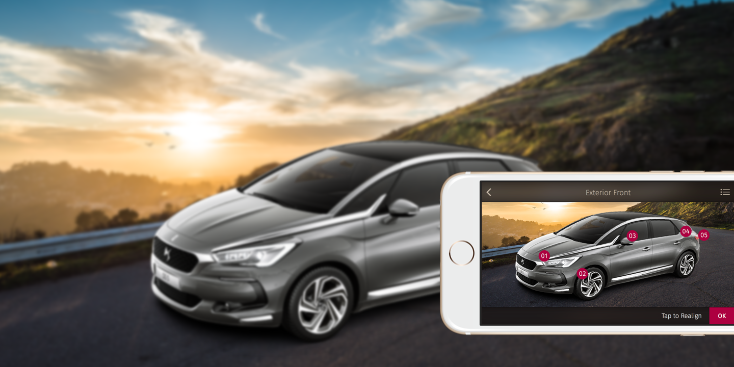
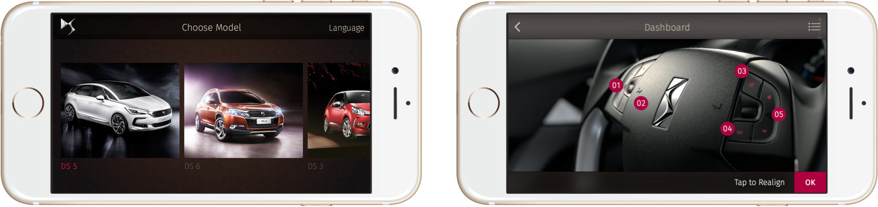
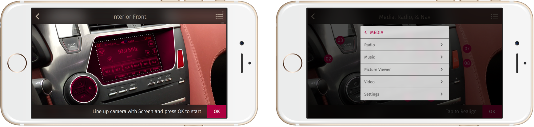
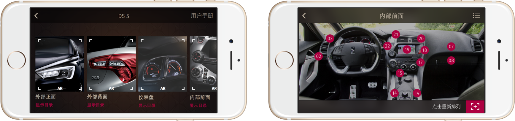
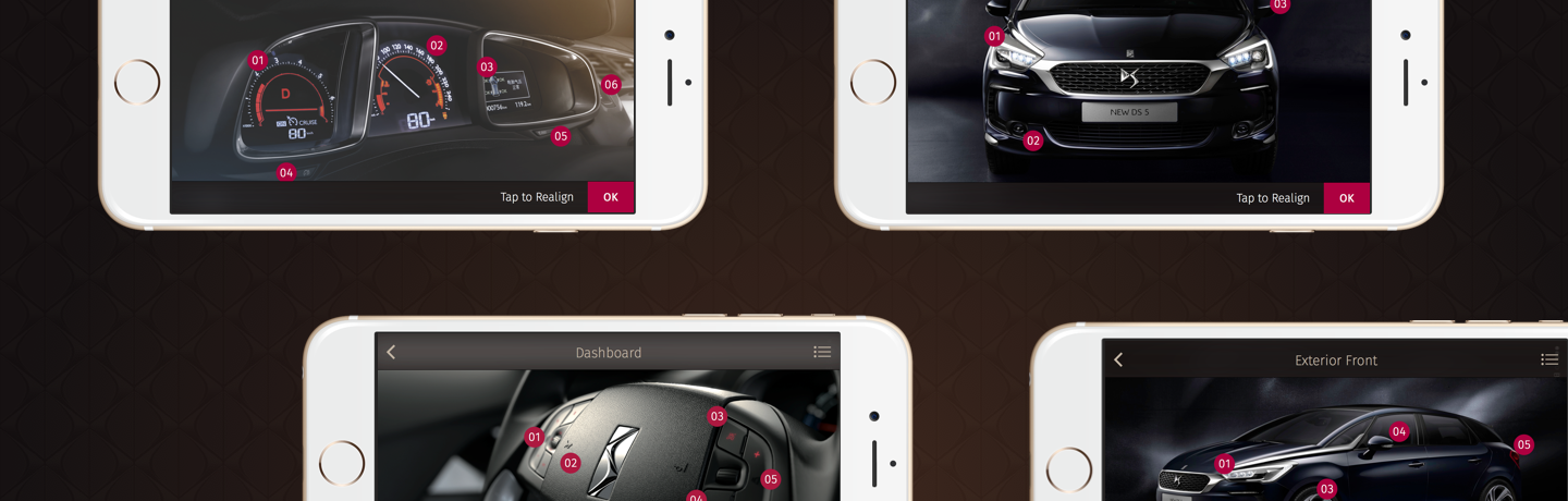
Figure 3: The Chinese version of the app was consistent with the English with a few changes to allow for greater legibility.
© Jason Wong. All Rights Reserved.