

JetBlue
JetBlue is a high-value low-cost carrier based in NYC. For the past decade they have sought to bring humanity back to air travel. Always focused on great service and enjoyable amenities, JetBlue sought to evolve their brand and plane interiors. The goal of the project was to revive and refresh the brand for customers and crew alike.
An extremely comprehensive project, it spanned from brand and service strategy to interior details for plane seats.
Year
2012
Discipline
Industrial Design
Responsibilities
Research, Ideation, CMF, & Plane Interior Design
Color Material Finish
Previously JetBlue's interior consisted of dull and monotone grays. As the project progressed JetBlue and our team decided that evolving the previous interior by adding contrast and pop colors would respect the old interior while developing the new interior into an energetic experience.
Providing JetBlue a detailed color balance would allow for the implementation of colors in the correct proportion. Further, specific materials and finishes were selected for JetBlue and B/E Aerospace, seat manufacturer.
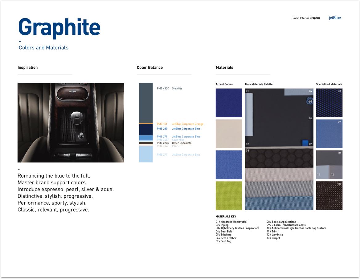

Graphite
Initially, 3 directions (Graphite, Espresso, and Ink) were proposed. After multiple sessions working with JetBlue, we incorporated the brightness of Ink with the greys found in Graphite. For JetBlue Graphite was a direction that evolved the existing interior by paying homage and strong enough to refresh the whole cabin interior.
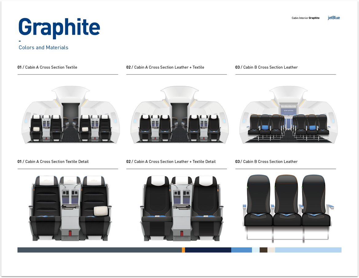
Cabin Interior
The Cabin Interior applied the color, material, and finishes that were specified. The interior incorporates this new direction in proportions that make sense to the overall scheme. Accents such as stitching, seatbelts, and tags used the new colors to provide contrast and freshness.

Cabin A
As JetBlue sought to grow its transcontinental clientele, they decided to introduce lie‐flat seat allowing passengers to sleep while flying. The lie‐flat cabin has a unique configuration. Passengers sit in either a one person or two person row. This allows couples and singles to have their own privacy while flying.
Extremely important in the flying experience is lighting. With the advent of LED lights, JetBlue was able to program sequences and different colored light during the day.
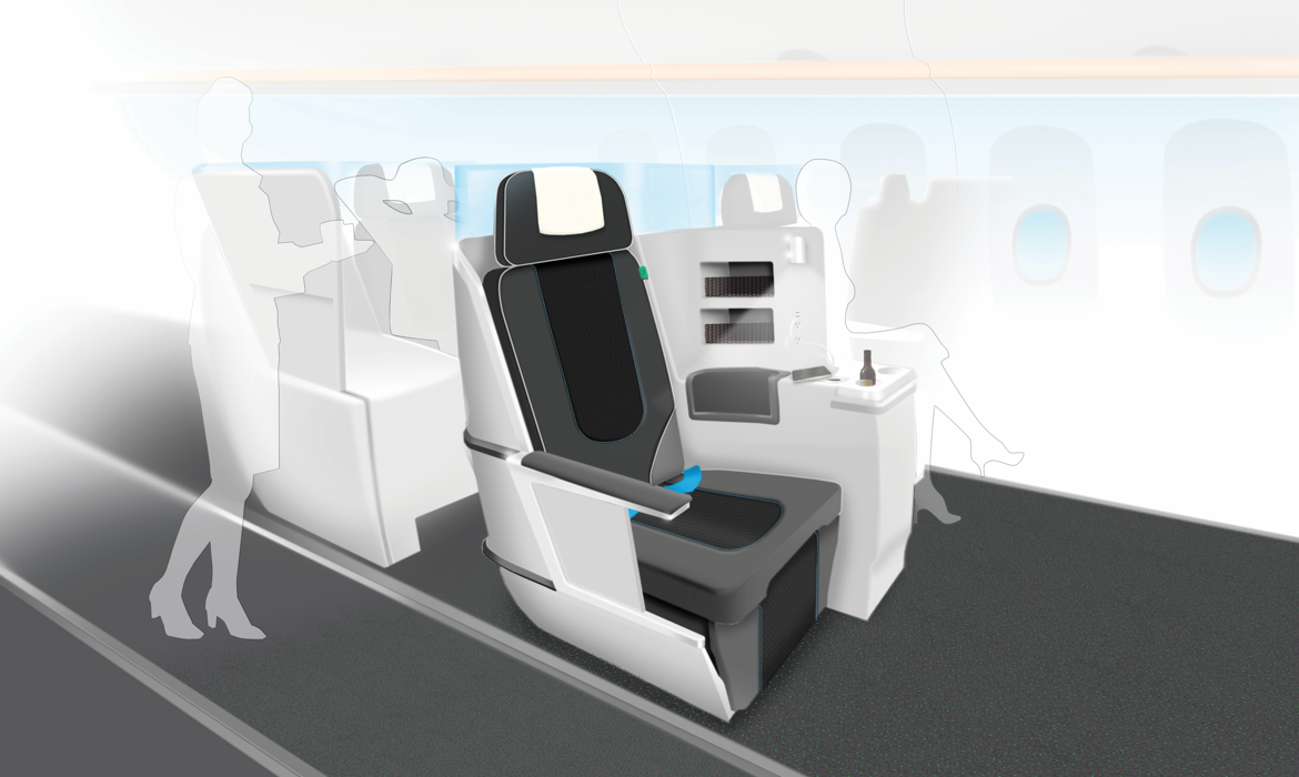

Figure 1: Illustrated here is the day experience of Cabin A. The lighting is an important tool to create a welcome environment unique to JetBlue.
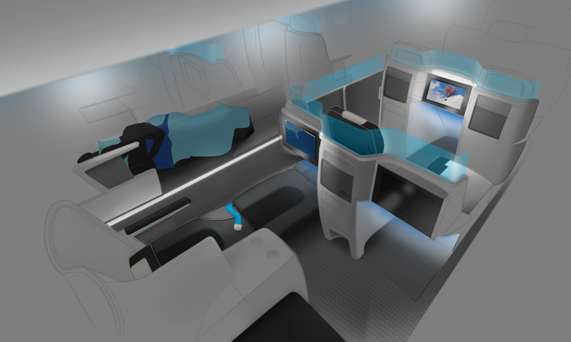

Figure 2: The night experience of Cabin A displays passengers sleeping in a lie-flat position. Here we can see the two people and one person per row configuration.
Innovation Space
The new interior was completed in conjunction with JetBlue's purchase of the A321 plane. The larger plane along with the introduction of the lie‐flat seat allowed JetBlue to make use of a small area behind Cabin A. Initial ideas included a stretching area, coffee bar, and vending machine. Ultimately with JetBlue feedback, a combination of a coffee bar and vending machine was designed and implemented. This vending machine also reduced flight attendant workload and allowed JetBlue to introduce new products to passengers while onboard.
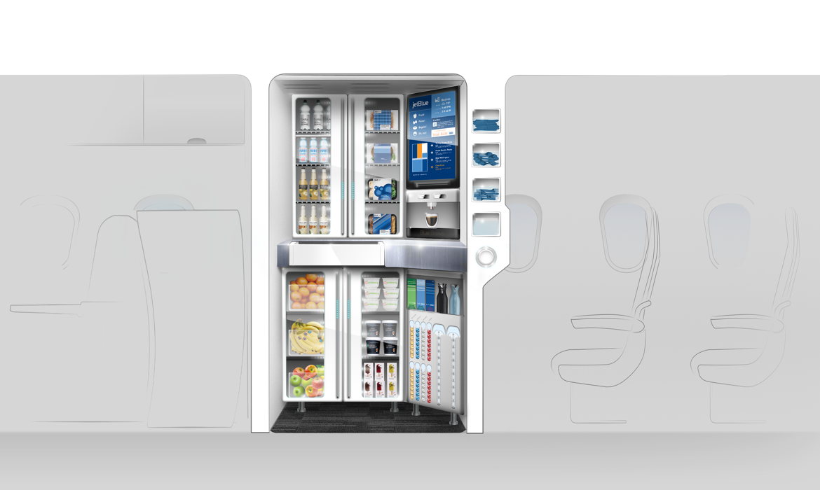

Figure 3: The innovation space provided an area for a passenger to make themselves their own coffee or grab an apple; passengers no longer needing to wait on a flight attendant to retrieve it for them.
Cabin B
Not to be overlooked Cabin B is uniquely JetBlue. Adopting the principles detailed in the color, material, and finish strategy Cabin B incorporates different shades of grey and pop colors (blue, green, and orange).
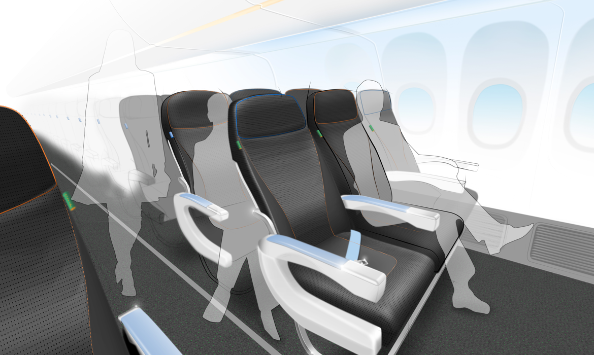

Figure 4: As most of the passengers would be seated in Cabin B, the interior reflects many of the same qualities as Cabin A.
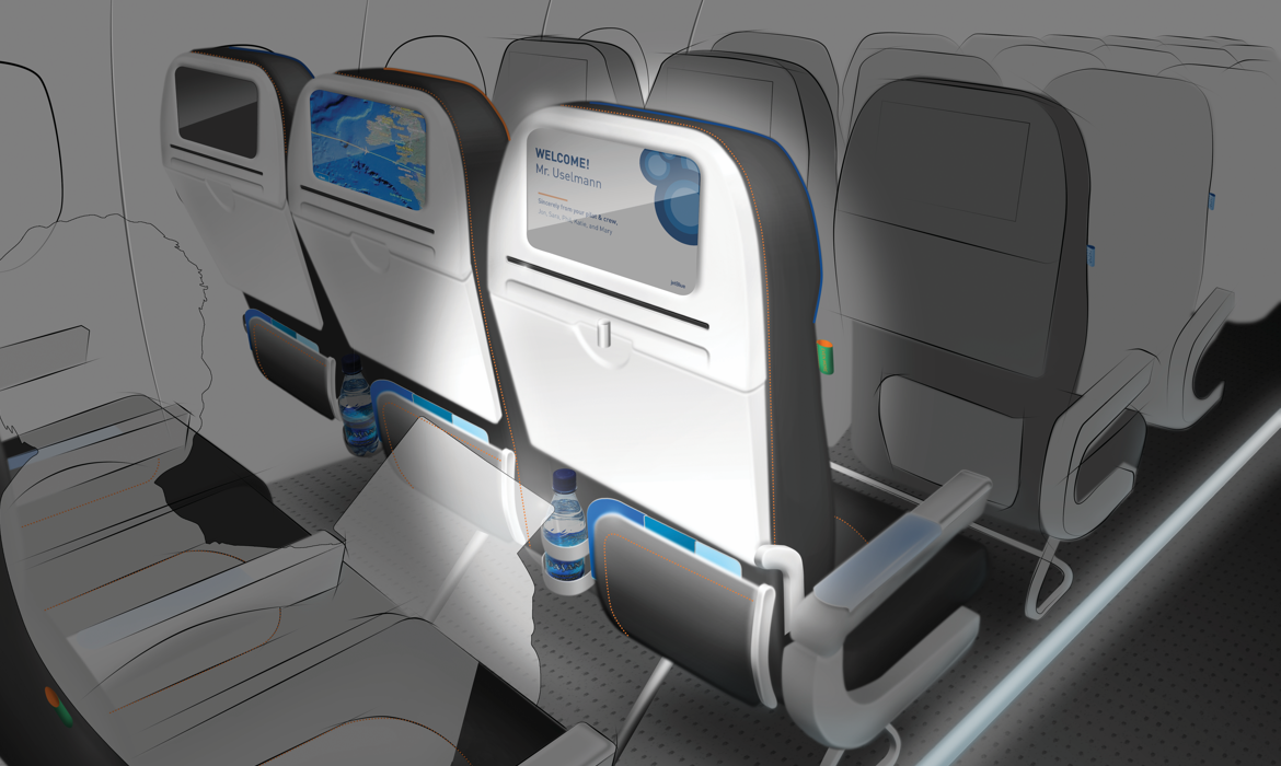

Figure 5: Here we see a personalized welcome screen for a long time flier during a redeye night flight.
Travel Enhancements
In addition to designing the interior, our team was tasked with enhancing the flying experience in other areas. I visualized how business travelers could benefit from a bureau and seat back lighting. Personalizing the experience for the traveler with a welcome screen would allow for a memorable and compassionate touchpoint. Slight changes such as a half-sized food cart helped JetBlue envision possible alternatives that would enable passengers to have a more comfortable experience.
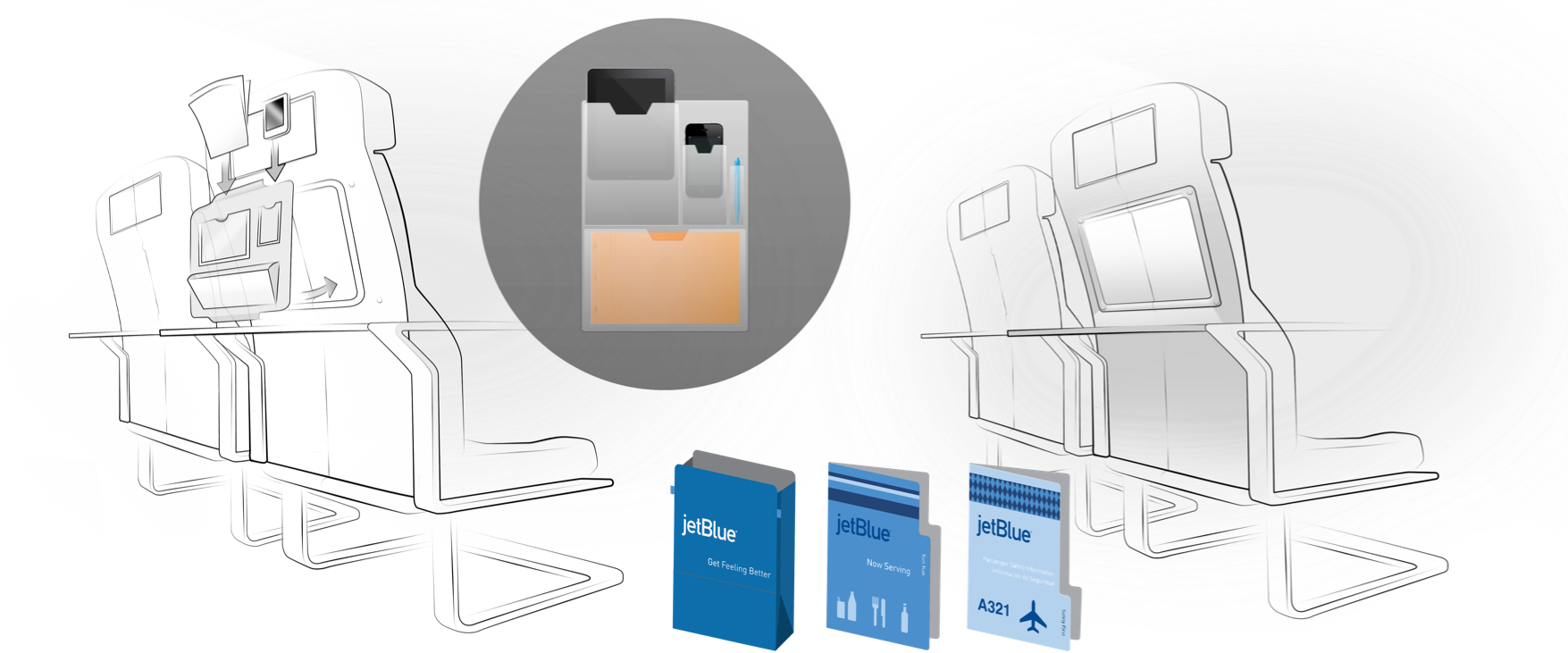

Figure 6: We developed an array of ideas in quick succession from simple solutions such as a light well, tabbed menus, and a work organizer for business travelers.
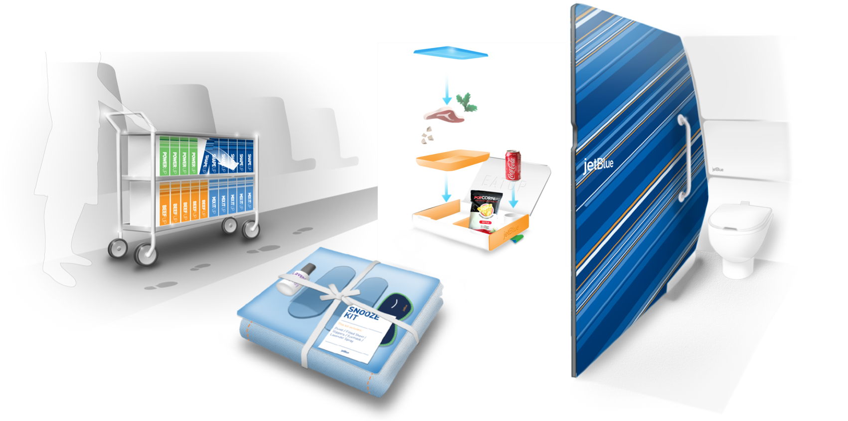

Figure 7: The cabin enhancements also included a half size cart, a bento inspired food tray, the introduction of the iconic JetBlue patterns inside the plane, and amenities inside the bathroom.
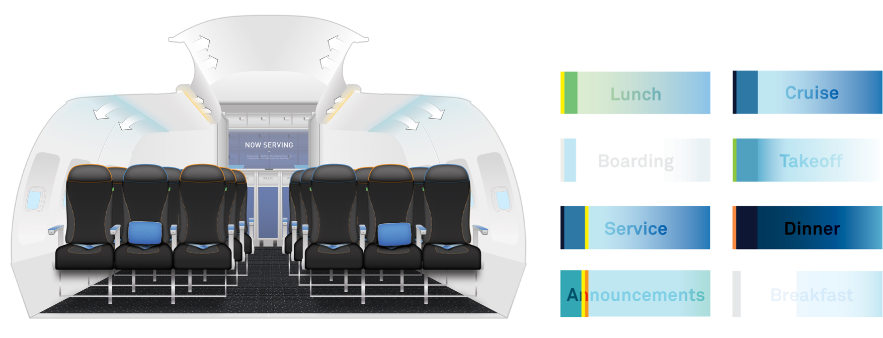

Figure 8: Additionally lighting was proposed, including a LED lighting sequence for the different portions of the flight.
Final Interior
The final interior completed by Jetblue captures the direction we had set forth. As with any project slight changes were made due time and budget constraints. However, the project was a success.
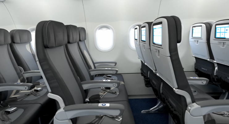

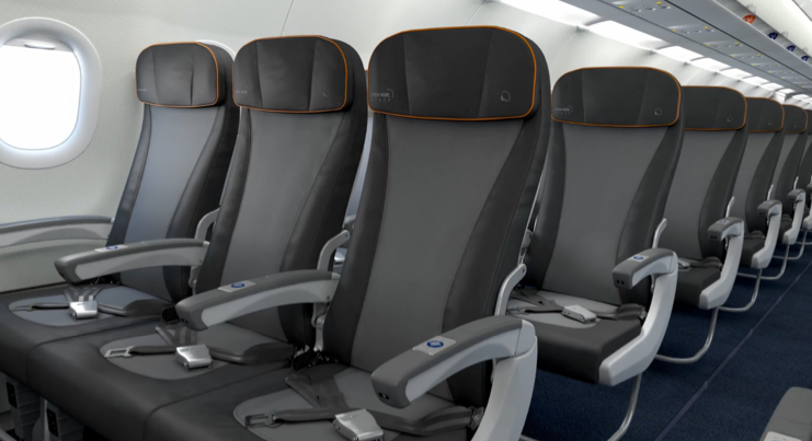

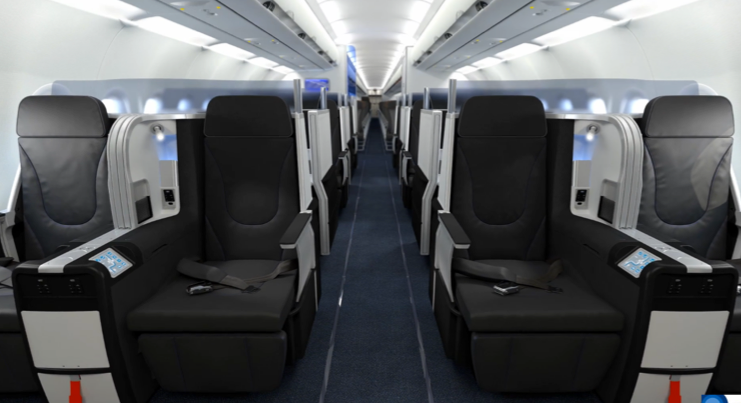

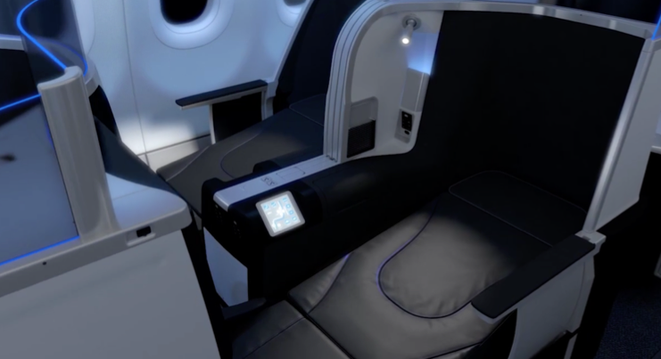

Figure 9: Pictured top left and right is Cabin B. Pictured bottom left and right is Cabin A. Images courtesy of JetBlue.
© Jason Wong. All Rights Reserved.
